01/01/2023
Sunday


Project Overview
The HPP Website Redesign project aimed to improve the user experience and information architecture of Carnegie Mellon's Health Professions Program (HPP) website. Through user research, competitive analysis, and content audits, the project team identified key usability issues such as poor navigation, overwhelming content blocks, and a lack of clear pathways for different student audiences. These insights informed a set of design recommendations focused on making the site more intuitive, visually engaging, and accessible to both current and prospective students seeking advising and pre-health resources.
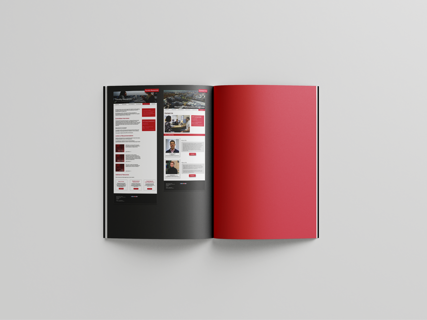
The final deliverables included an official proposal document outlining detailed redesign recommendations, which was presented to Carnegie Mellon’s CMS team for potential implementation. In addition to the proposal, a high-fidelity Figma prototype was developed to visually demonstrate the proposed layout, navigation, and content hierarchy. This prototype served as a functional reference to guide future development efforts and to showcase how the redesigned website could support HPP’s mission more effectively.


Identifying Users
The first step in the HPP website redesign process involved identifying the primary user groups—prospective students, current students, and faculty advisors. Through stakeholder meetings and analysis of existing site traffic, we defined key user needs and goals. This informed our design decisions moving forward, ensuring the new site structure and content would be tailored to its most relevant audiences.
.jpg)
User Diagrams: identifying target audiences and their thought processes while navigating the HPP website
User Study Plan & Report
The user study plan outlined our goals, methods, and participant criteria. We aimed to evaluate how easily users could navigate the current HPP site and identify specific usability challenges. The plan included task scenarios, survey questions, and success metrics for consistent data collection.
The user study report summarized key findings from our research, highlighting common navigation issues, unclear labeling, and user frustrations. It included both qualitative feedback and quantitative performance data, which we used to prioritize improvements in the redesign.
-
Conducted surveys and task-based usability tests with current users
-
Focused on common tasks (e.g., finding resources, booking appointments)
-
Collected feedback on navigation, content clarity, and overall experience
-
Identified usability issues and user frustrations
-
Insights directly informed redesign decisions and priorities
Card Sorting Analysis
We conducted a card sorting activity to understand how users naturally group and label content. Participants organized topics into categories that made sense to them, revealing patterns in user mental models. The results guided our site’s information architecture, helping us restructure the navigation to better align with user expectations and improve overall usability.

Best Merge Method demonstrates how different topics should be grouped together to maximize effiency

Actual Agreement Method shows how the selected users would group the topics based on their judgment
Navigation Hierarchy & Rough Sketches
We developed a revised navigation hierarchy grounded in the results from card sorting and user studies. The updated structure prioritizes clarity and accessibility, ensuring users can easily find key resources, explore programs, and access support services with minimal effort.
Initial wireframe sketches were created to visualize layout concepts and key page elements based on user feedback and research insights. These low-fidelity drafts helped us explore content placement, user flow, and interface structure before moving into digital prototyping.


Rough Sketch #1 - Sina Lin


Rough Sketch #3 - Thon Prom.
Rough Sketch #2 - Shannon Horning
Figma Prototyping


Reflection
Redesigning the HPP website was a rewarding and eye-opening experience. It showed me how much thought goes into making a site truly user-friendly, especially when the audience has such specific needs. From mapping out who the users were to testing our ideas through user studies and card sorting, every step taught me something new about how design and research work hand in hand.
One of the biggest takeaways was how small changes, like clearer labels or a better navigation structure, can make a huge difference in usability. Seeing feedback directly influence the design was satisfying and reminded me that good design is always grounded in real user experience.


